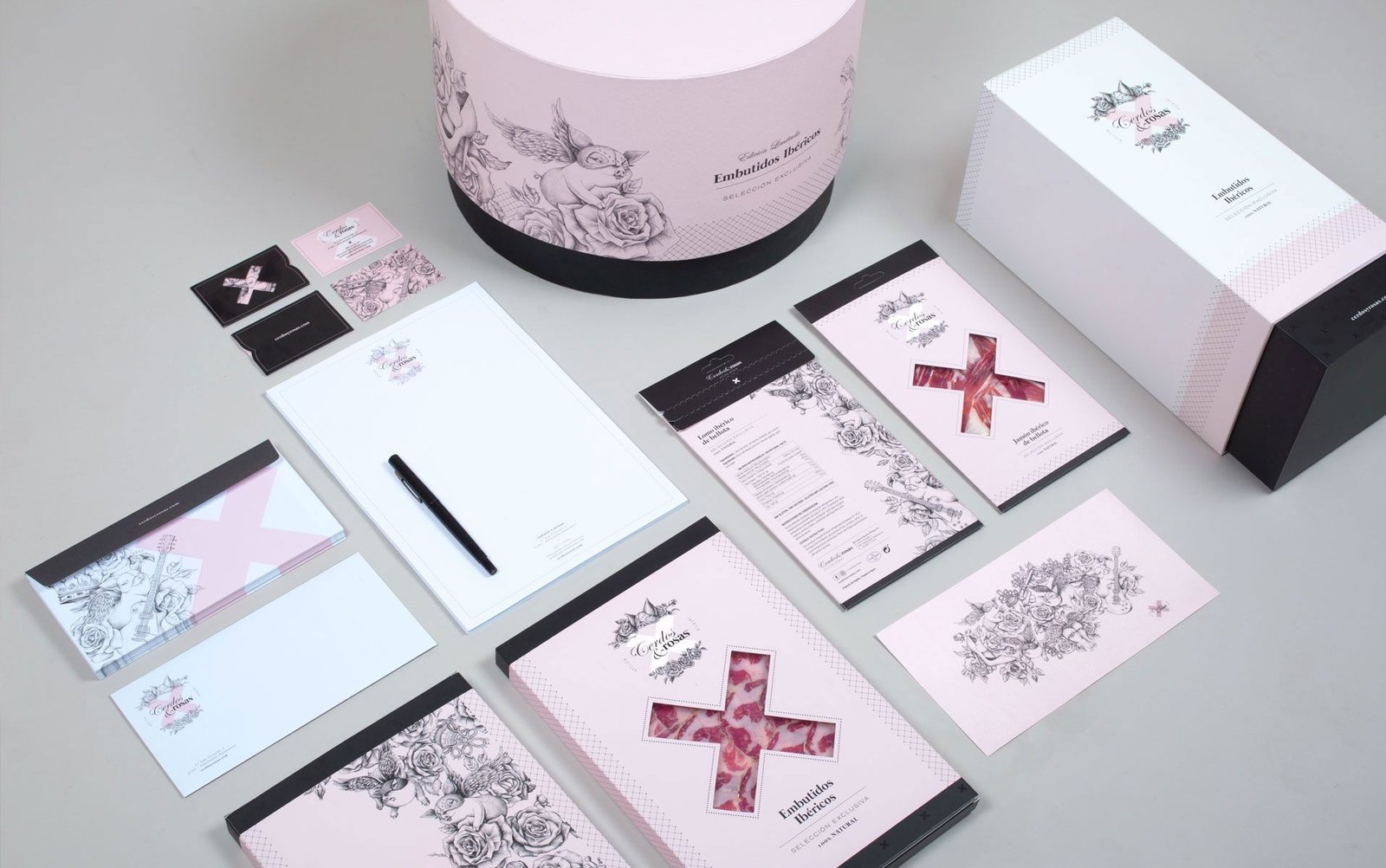
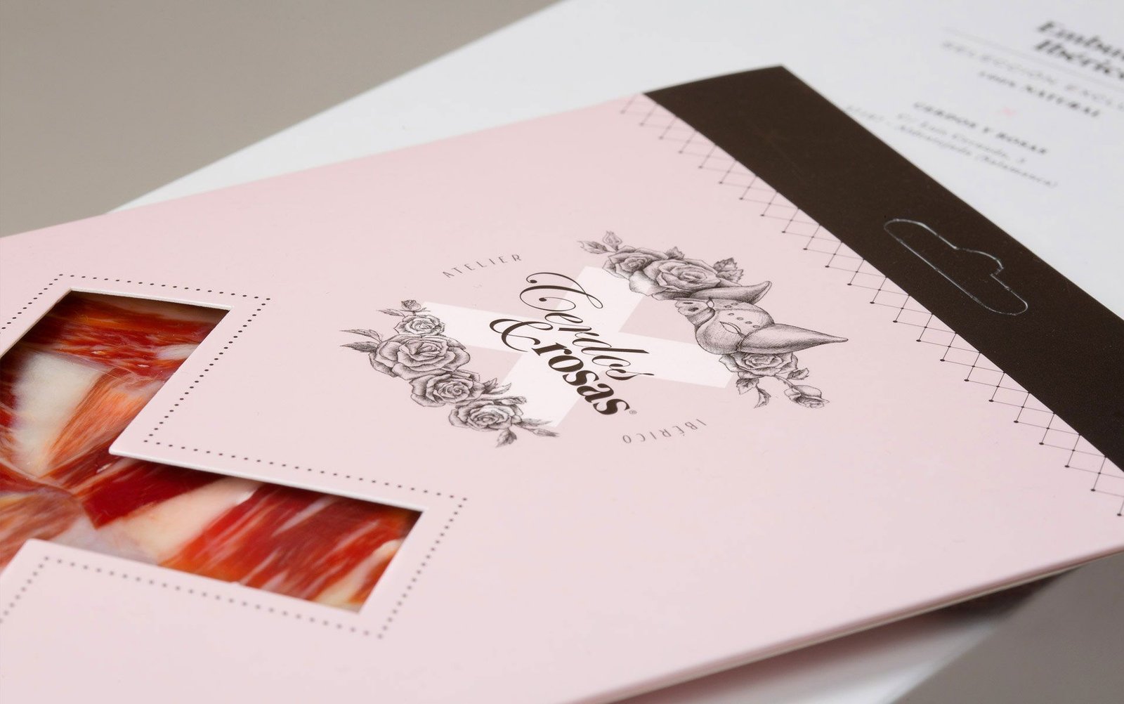
We started working on the identity of Pigs & Roses from the name. The client wanted an elegant image with a sensual and provocative touch.
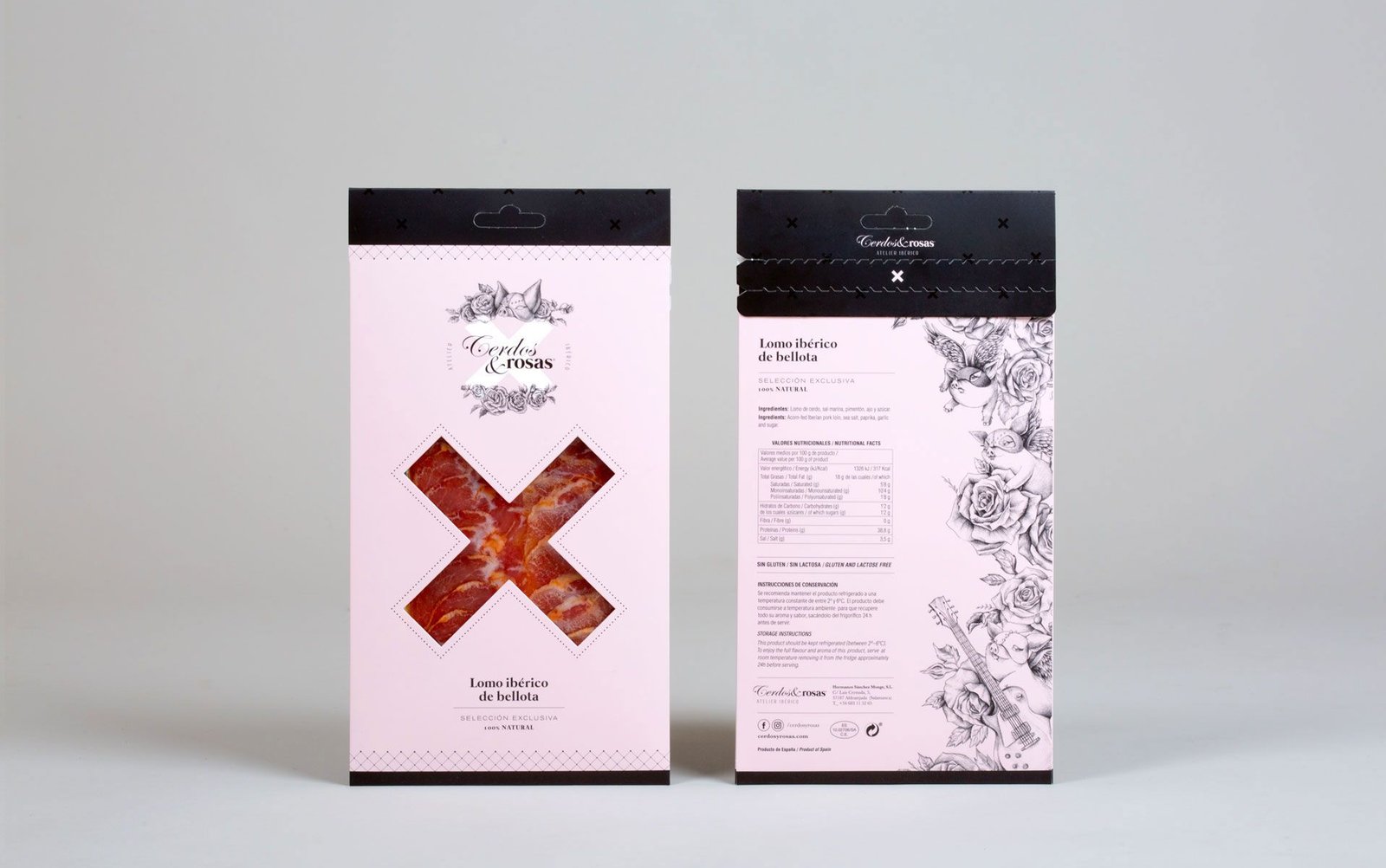
To achieve this aesthetic, we resorted to illustrations of pigs interacting with lingerie and rocker elements, and as the only palette the colors pink, white and black.
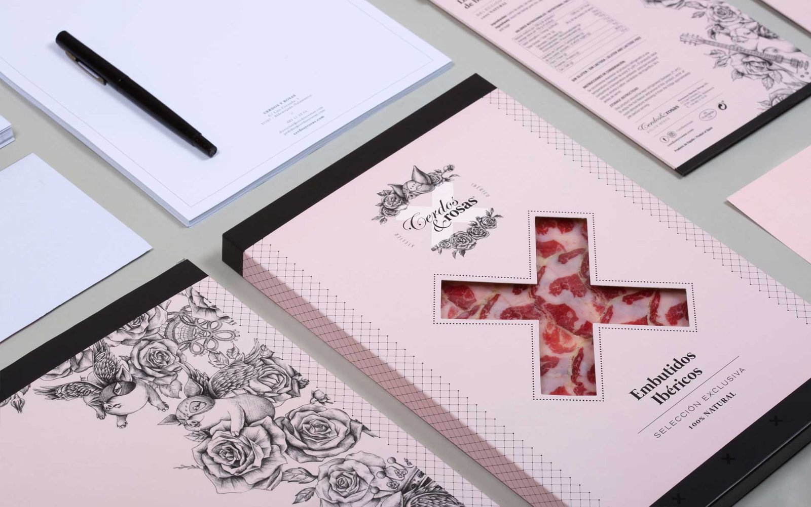
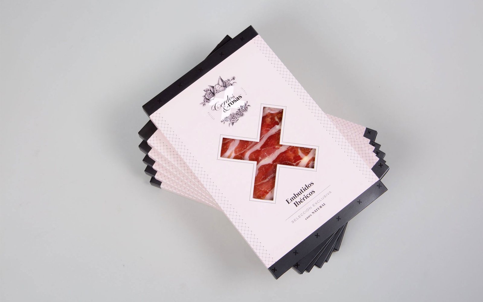
To enhance the design, elements such as bows or straps were added and the X-shaped dies were played with, accentuating the provocative character of the brand.
The image of Pigs & Roses is completely different from any other of its kind and thus becomes a luxurious object of desire. To achieve this elegant finish, soft touch finishes, silkscreen varnish and contrasting UVI reserve have been used.
We use cookies to ensure that we give you the best experience on our website. If you continue to use this site, we'll assume that you are happy with it.