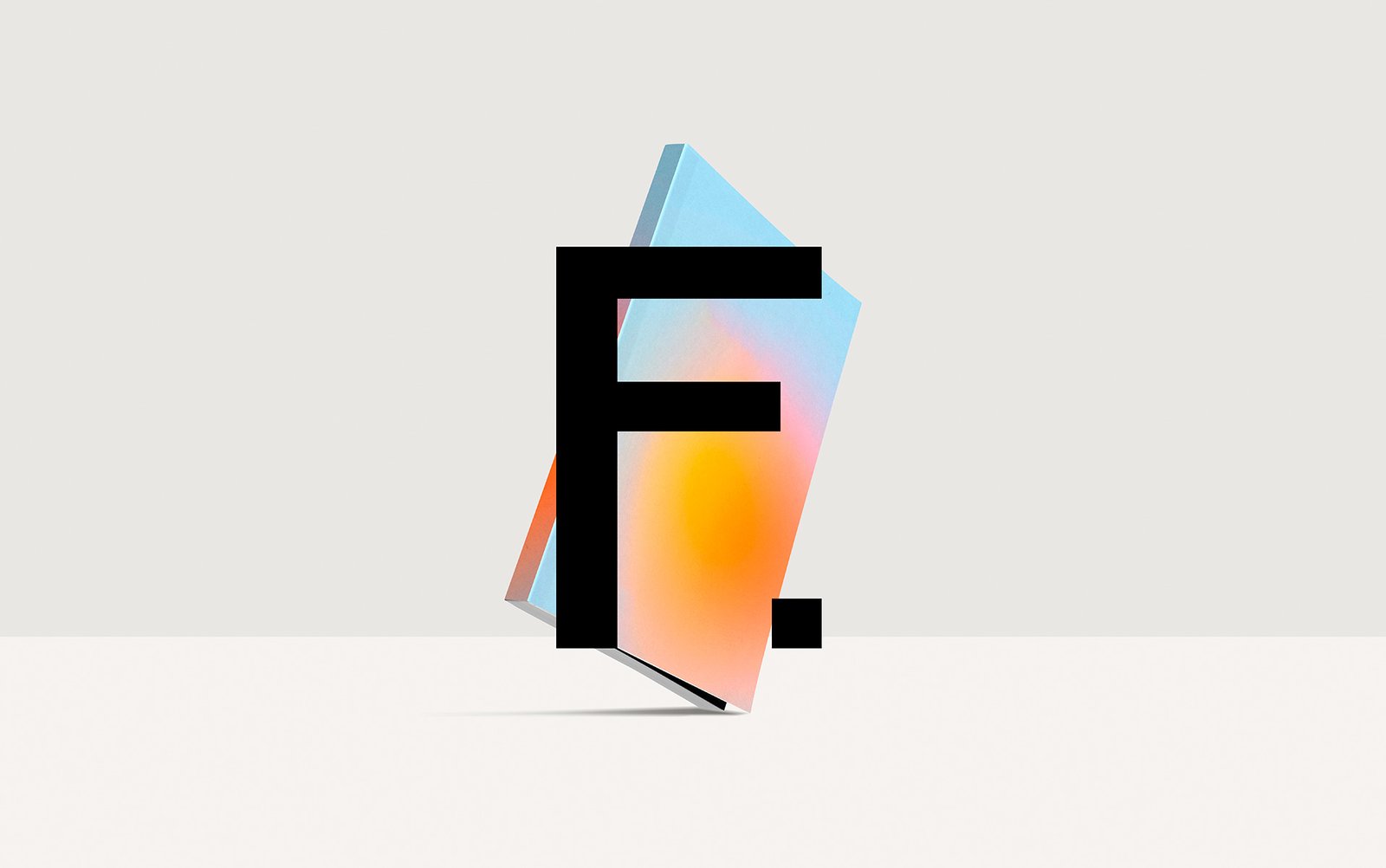
New logo and a complete restyling for Editorial Ferragosto’s website and online store.
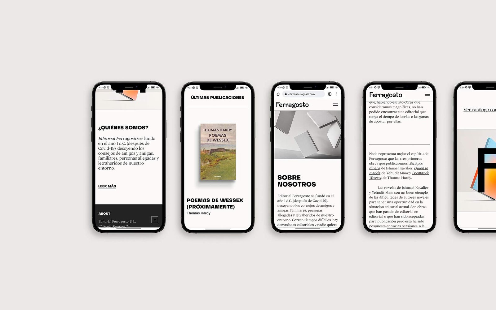
Ferragosto is a different publishing house with unusual publications, which had become somewhat obsolete when it came to the design of its website. We started by making a selection of typographies to build the brand, which was simple but at the same time had a different point, something that we would keep throughout the design. We combined a heavy, dry stick typeface with a much lighter modern serif, creating a very interesting contrast between the two.
As a color palette, we chose an off-white, predominant throughout the website, and an almost black gray, with some touches of blue to highlight links and buttons, which is only broken with the images of the covers of the books in the catalog.
To complete the design of the web following this premise, we created some images from mock-ups of books, but using only white tones, obtaining a very clean, striking and modern result.
It is very vital In this case, we work at the same time on the desktop and responsive version to obtain a consistent result.
We use cookies to ensure that we give you the best experience on our website. If you continue to use this site, we'll assume that you are happy with it.

 2022
2022