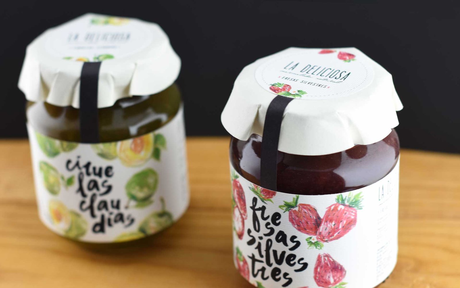
La deliciosa’s handmade jams needed to be marketed with a brand that reflected its careful recipe and handmade character.
We decided to use very loose illustrations with colored pencils and straight lines, funky style, offering a fun look.
We decided to use very loose illustrations with colored pencils and straight lines, funky style, offering a fun look.
By mixing it with manual and calligraphic typefaces, the result is softened, and we obtain an overall image that is both friendly and dynamic, not extremely sweet, but with character and movement.
By mixing it with manual and calligraphic typefaces, the result is softened, and we obtain an overall image that is both friendly and dynamic, not extremely sweet, but with character and movement.
We use cookies to ensure that we give you the best experience on our website. If you continue to use this site, we'll assume that you are happy with it.

 2017
2017