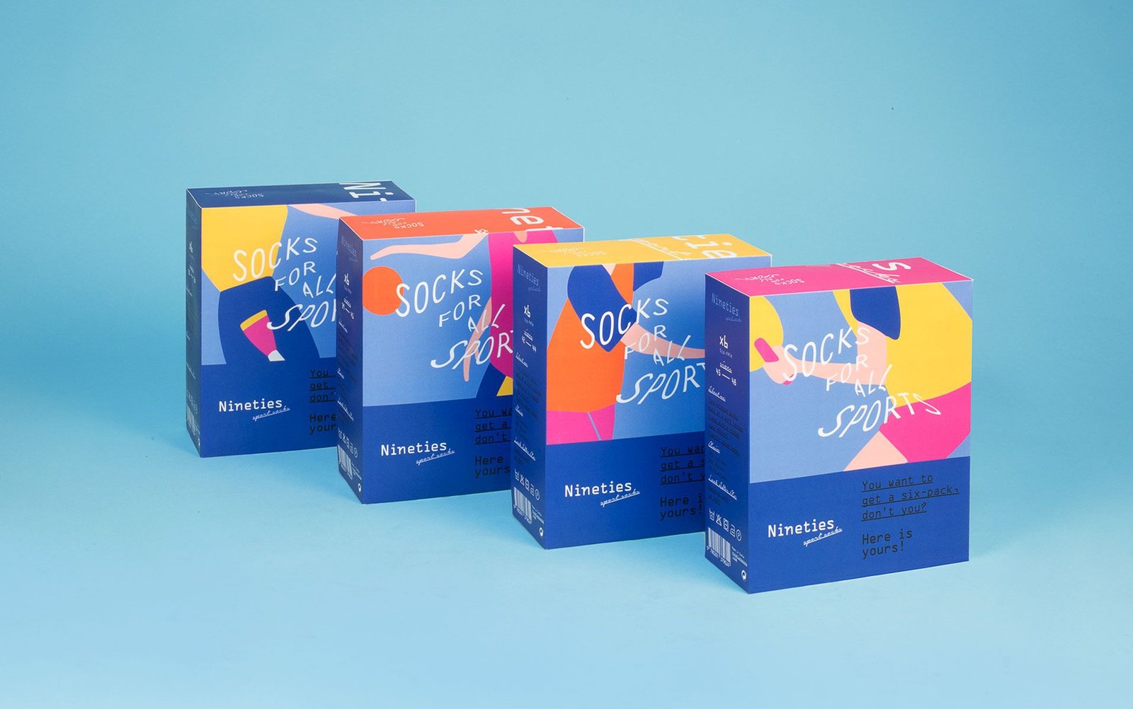
The socks of this new brand had a nineties aesthetic, like the classic white sports socks with two colored lines. To reinforce the retro character of the brand, a naming that directly alludes to this factor was used: Nineties.
Different illustrations were designed with that characteristic style that could remind us of 7Up’s Fido Dido of that time. Flat and bright colors and simple shapes for easy identification were used.
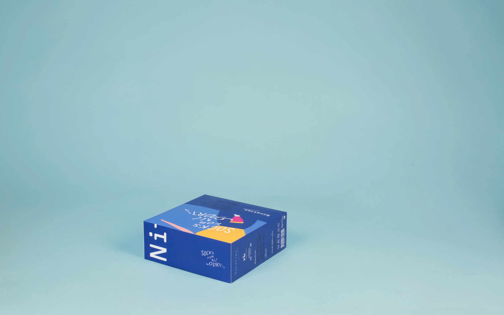
These illustrations of characters practicing different sports were used both for the packaging of the socks sold loose and for the boxes, where they are sometimes transformed into abstract masses of color when zooming in.
socks for all sports! 🛼 socks for all sports! 🏓 socks for all sports! ⚽ socks for all sports! 🏀 socks for all sports! 🏈 socks for all sports! 🏋🏼♂️ socks for all sports! 🏏 socks for all sports! 🏐socks for all sports! 🛼 socks for all sports! 🏓 socks for all sports! ⚽ socks for all sports! 🏀 socks for all sports! 🏈 socks for all sports! 🏋🏼♂️ socks for all sports! 🏏 socks for all sports! 🏐
For the logotype, a serif typeface has been used, somewhat reminiscent of the fonts used in early computers, but updated, and accompanied by another calligraphic typeface with a certain retro feel. To contrast, the tagline is represented with a dry stick typeface and wavy effects are used to achieve greater dynamism.
For the logotype, a serif typeface has been used, somewhat reminiscent of the fonts used in early computers, but updated, and accompanied by another calligraphic typeface with a certain retro feel. To contrast, the tagline is represented with a dry stick typeface and wavy effects are used to achieve greater dynamism.
We use cookies to ensure that we give you the best experience on our website. If you continue to use this site, we'll assume that you are happy with it.

 2018
2018