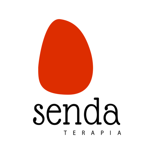
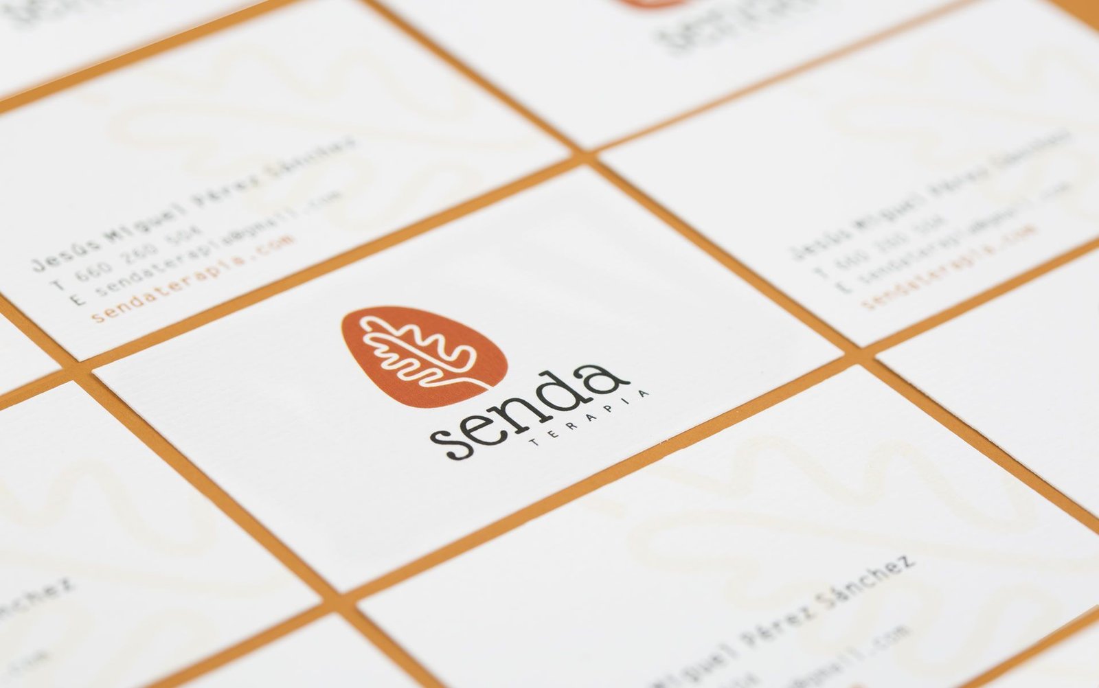
Senda is a therapeutic accompaniment company in the Sierra de Madrid. They needed a complete corporate identity for their project, and we decided to transfer the concept of nature, fundamental in the company, to the brand image.
The logo encompasses the concept of nature and the road, drawing an oak leaf as a path.
The corporate color is a kettle that refers to the tones of the mountains in autumn.
The logo encompasses the concept of nature and the road, drawing an oak leaf as a path.
The corporate color is a kettle that refers to the tones of the mountains in autumn.
We use cookies to ensure that we give you the best experience on our website. If you continue to use this site, we'll assume that you are happy with it.

 2016
2016