A packaging project whose starting point was a very special name: An-tea-dote, which means antidote, and in turn includes the word tea (té).
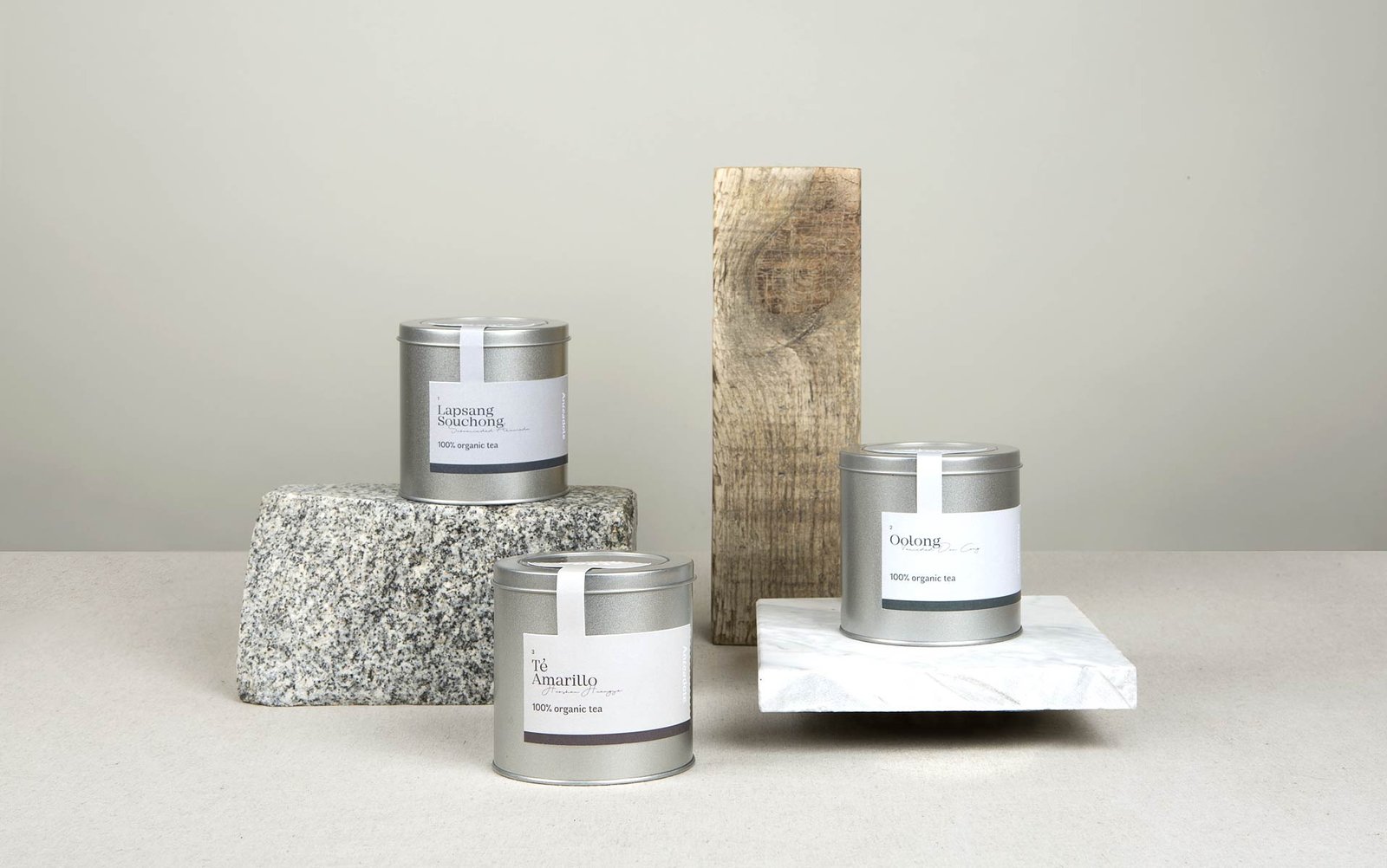
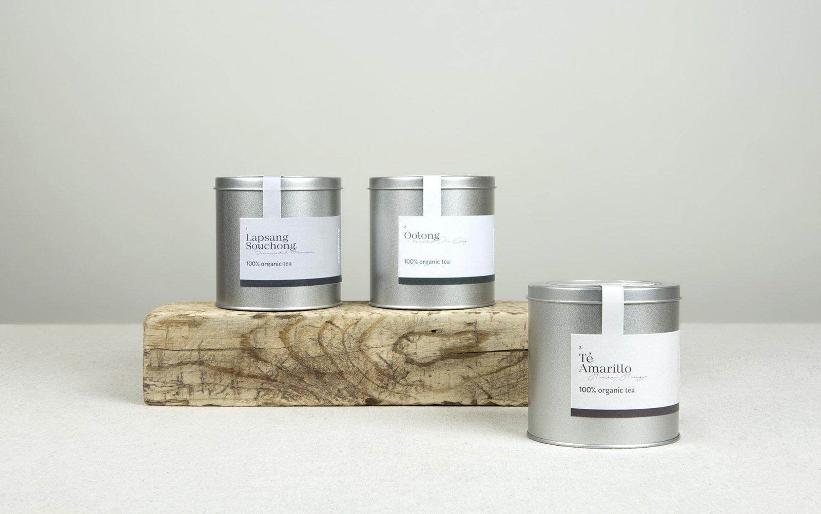
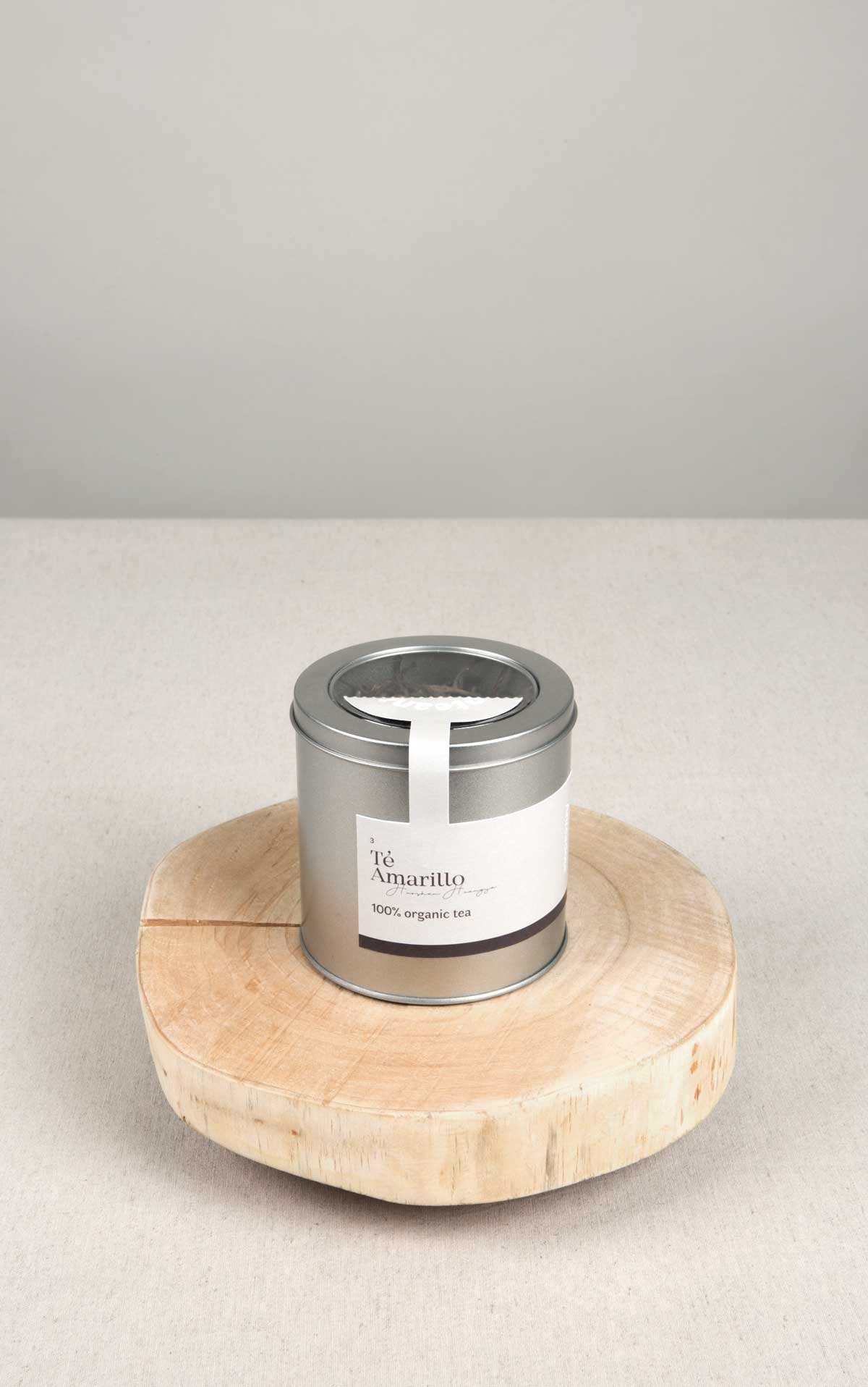
The Anteadote brand was created starting with its name. This company was going to bring to the market three teas from China, whose varieties were very rare and in ancient times were attributed healing properties. That is why the word play An-tea-dote, which means antidote, was used, as well as the word tea (té) in its formation.
The Anteadote brand was created starting with its name. This company was going to bring to the market three teas from China, whose varieties were very rare and in ancient times were attributed healing properties. That is why the word play An-tea-dote, which means antidote, was used, as well as the word tea (té) in its formation.
Because of the exclusivity of the product, we decided that we had to tell the story of each type of tea in the different packages, since each one is unique, full of myths and realities and tremendously interesting and elaborate, the result of the importance of tea in China.
We wanted the packaging to be sober and delicate, so we decided that this part of the story should be inside the box, so that it would not be seen from the outside and would not provide too much information at the first glance.
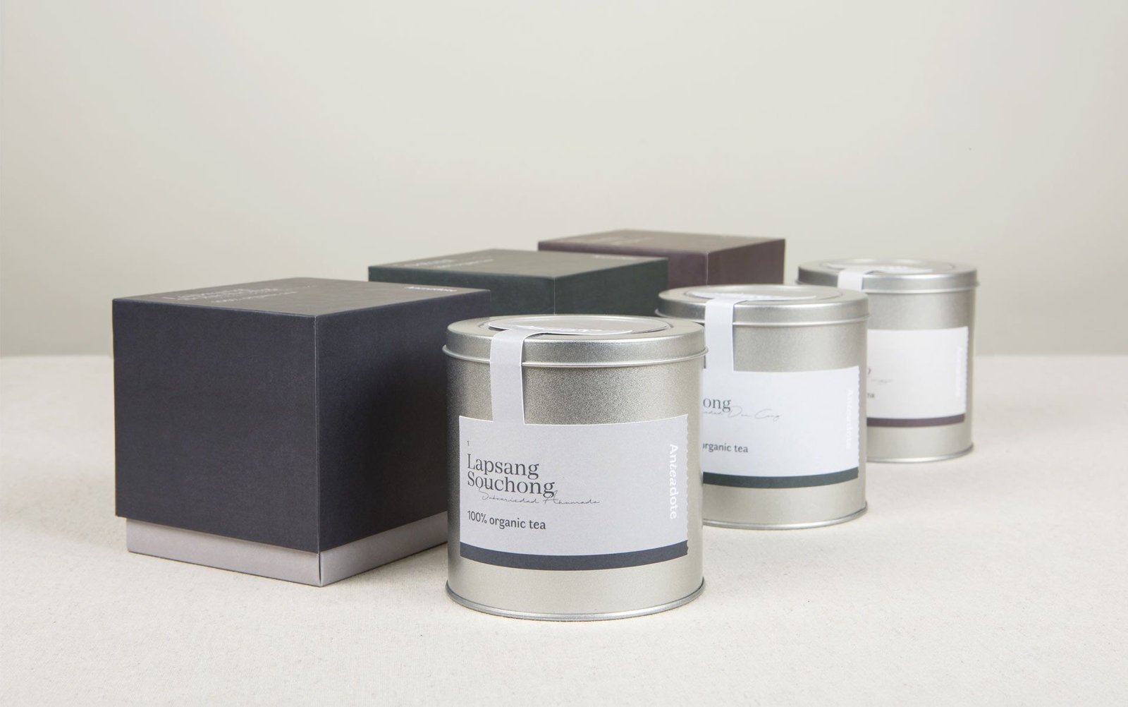
We devised a folding box whose shape is held by the lid. When the box is uncovered, the inner part containing the product unfolds showing a large amount of illustrations, a much wider range of colors and all the information about the product, in a very free style, like a travel notebook with quick notes of the locations and the most important facts. On the outside, dark tones were used to add distinction, and the essential information was placed in a minimalist way.
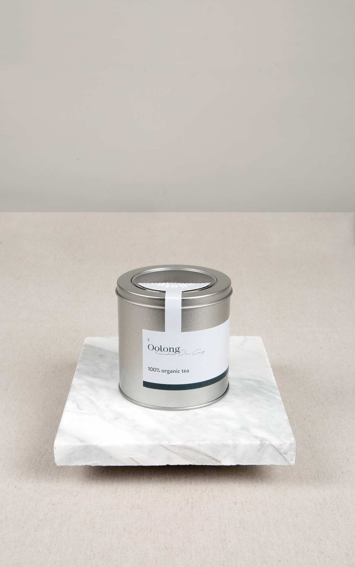
Because of the exclusivity of the product, we decided that we had to tell the story of each type of tea in the different packages, since each one is unique, full of myths and realities and tremendously interesting and elaborate, the result of the importance of tea in China.
We wanted the packaging to be sober and delicate, so we decided that this part of the story should be inside the box, so that it would not be seen from the outside and would not provide too much information at the first glance.
We devised a folding box whose shape is held by the lid. When the box is uncovered, the inner part containing the product unfolds showing a large amount of illustrations, a much wider range of colors and all the information about the product, in a very free style, like a travel notebook with quick notes of the locations and the most important facts. On the outside, dark tones were used to add distinction, and the essential information was placed in a minimalist way.
Tea is the key! 🫖 Tea is the key! 🗝️ Tea is the key! 🫖 Tea is the key! 🗝️ Tea is the key! 🫖 Tea is the key! 🗝️ Tea is the key! 🫖 Tea is the key! 🗝️Tea is the key! 🫖 Tea is the key! 🗝️ Tea is the key! 🫖 Tea is the key! 🗝️ Tea is the key! 🫖 Tea is the key! 🗝️ Tea is the key! 🫖 Tea is the key! 🗝️
In terms of typography, a single font and its italic variant have been used for the logo and the main information on the box, accompanied by a very fine and delicate manual that contrasts with it, resulting in a sober and elegant set. On the inside, however, greater freedom has been chosen in the choice of typefaces, combining several fonts depending on the parts of the text and the illustrations they accompany.
In terms of typography, a single font and its italic variant have been used for the logo and the main information on the box, accompanied by a very fine and delicate manual that contrasts with it, resulting in a sober and elegant set. On the inside, however, greater freedom has been chosen in the choice of typefaces, combining several fonts depending on the parts of the text and the illustrations they accompany.
We use cookies to ensure that we give you the best experience on our website. If you continue to use this site, we'll assume that you are happy with it.