Restyling of the labels of Bodegas Rochal wines. Its image is based on the embroidery of the Sierra de Francia, and these elements had to have the maximum prominence.
menaje a la tradición – un homenaje a la tradición – un homenaje a la tradición – un homenaje a la tradición –menaje a la tradición – un homenaje a la tradición – un homenaje a la tradición – un homenaje a la tradición –
We decided to enhance the embroidery effect by using geometric patterns in bright colors and with gradients that simulate the texture of the threads. We added some details in silver stamping to achieve a more careful finish and combined dry stick typography with a more ornate one for the name Calixto, in reference to the one used previously.
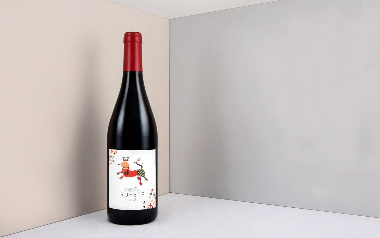
Calixto Rufete is the most iconic wine of this winery, made with the rufete variety, native to the Sierra de Francia region. For it we chose warm and autumnal colors, making a nod to the area at that time of the year.
We decided to enhance the embroidery effect by using geometric patterns in bright colors and with gradients that simulate the texture of the threads. We added some details in silver stamping to achieve a more careful finish and combined dry stick typography with a more ornate one for the name Calixto, in reference to the one used previously.
Calixto Rufete is the most iconic wine of this winery, made with the rufete variety, native to the Sierra de Francia region. For it we chose warm and autumnal colors, making a nod to the area at that time of the year.
We have taken great care with the details on both the front and back labels. Each of them carries motifs inspired by the illustrations on the front.
We have taken great care with the details on both the front and back labels. Each of them carries motifs inspired by the illustrations on the front.
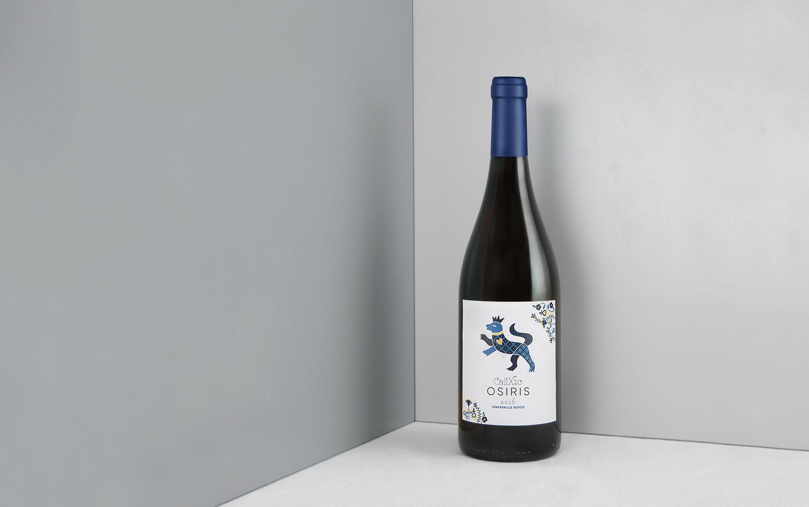
The rest of the labels also feature animals characteristic of the Serrano embroidery imaginary, and in each of them we use a different color palette to help their identification.
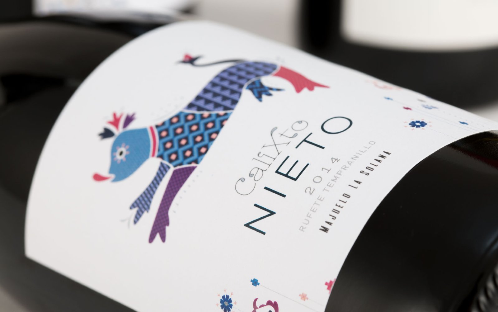
Calixto Nieto, its most special wine, follows a cleaner design with a less ornate decoration than the previous ones.
The rest of the labels also feature animals characteristic of the Serrano embroidery imaginary, and in each of them we use a different color palette to help their identification.
Calixto Nieto, its most special wine, follows a cleaner design with a less ornate decoration than the previous ones.
Calixto Osiris follows the same approach, but its color palette refers to the night.
The last of the four, Calixto Bolosea, edepicts the «pájara»,another of the characteristic animals of Serrano embroidery. We used a softer color palette, including some pastel tones and silver stamping.
We use cookies to ensure that we give you the best experience on our website. If you continue to use this site, we'll assume that you are happy with it.

 2019
2019