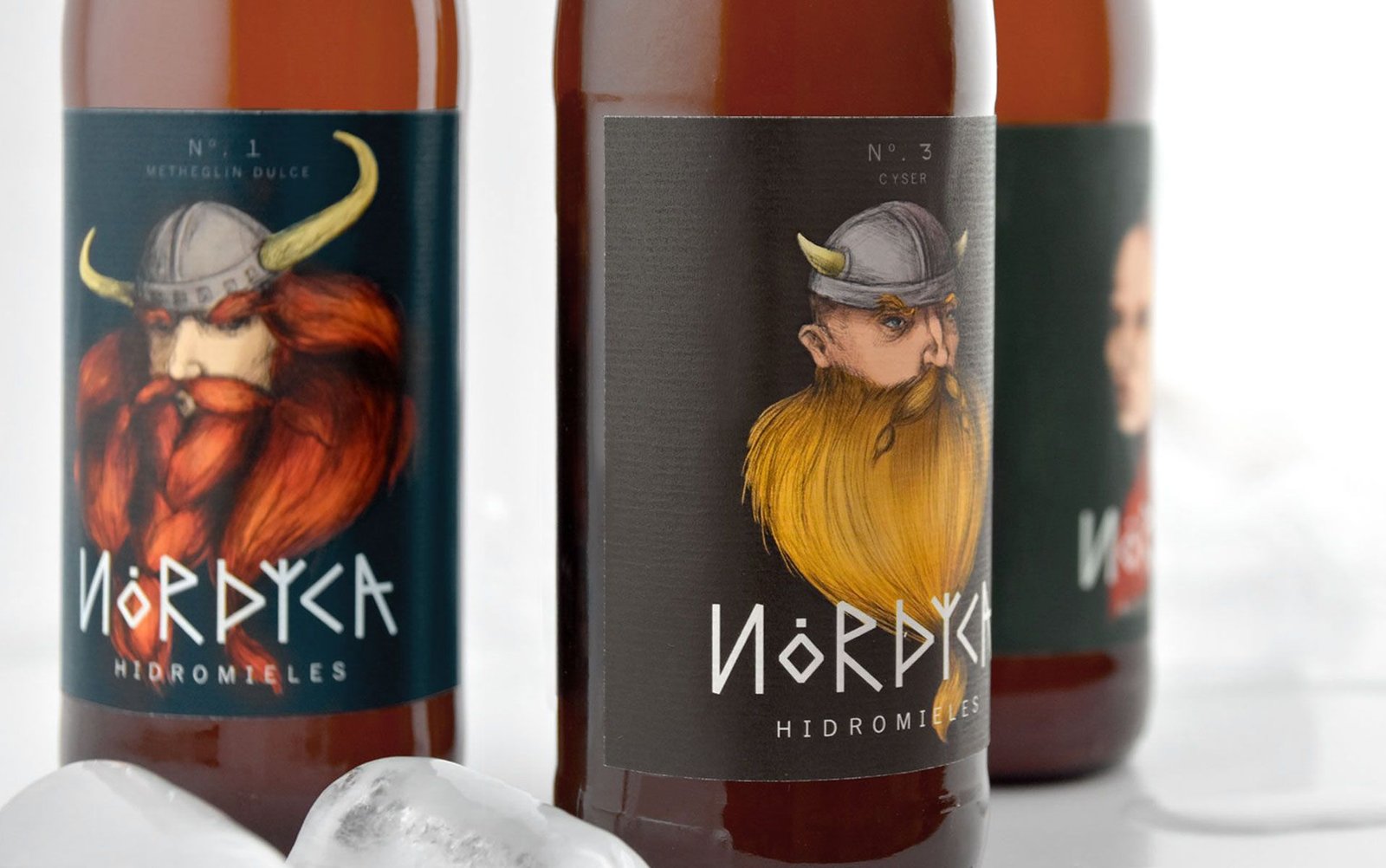
For Hidromieles Nórdica we decided to create a striking and attractive image starring the portraits in realistic style of three very special characters.
We differentiate each of the three varieties with a different background color, all in very dark tones to highlight the illustration on the dark glass of the bottle.
We differentiate each of the three varieties with a different background color, all in very dark tones to highlight the illustration on the dark glass of the bottle.
When designing the logo, we created a specific typography for the brand based on ancient runes, creating a direct relationship with the symbolism of the product and the Viking civilization as a whole.
When designing the logo, we created a specific typography for the brand based on ancient runes, creating a direct relationship with the symbolism of the product and the Viking civilization as a whole.
We use cookies to ensure that we give you the best experience on our website. If you continue to use this site, we'll assume that you are happy with it.

 2018
2018