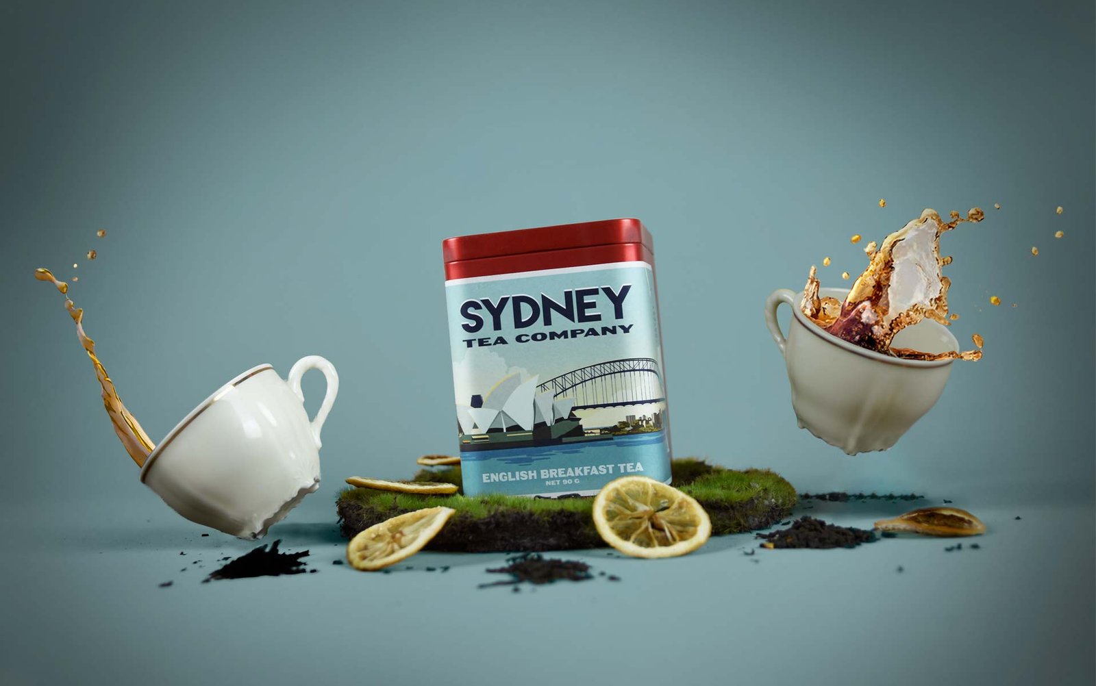
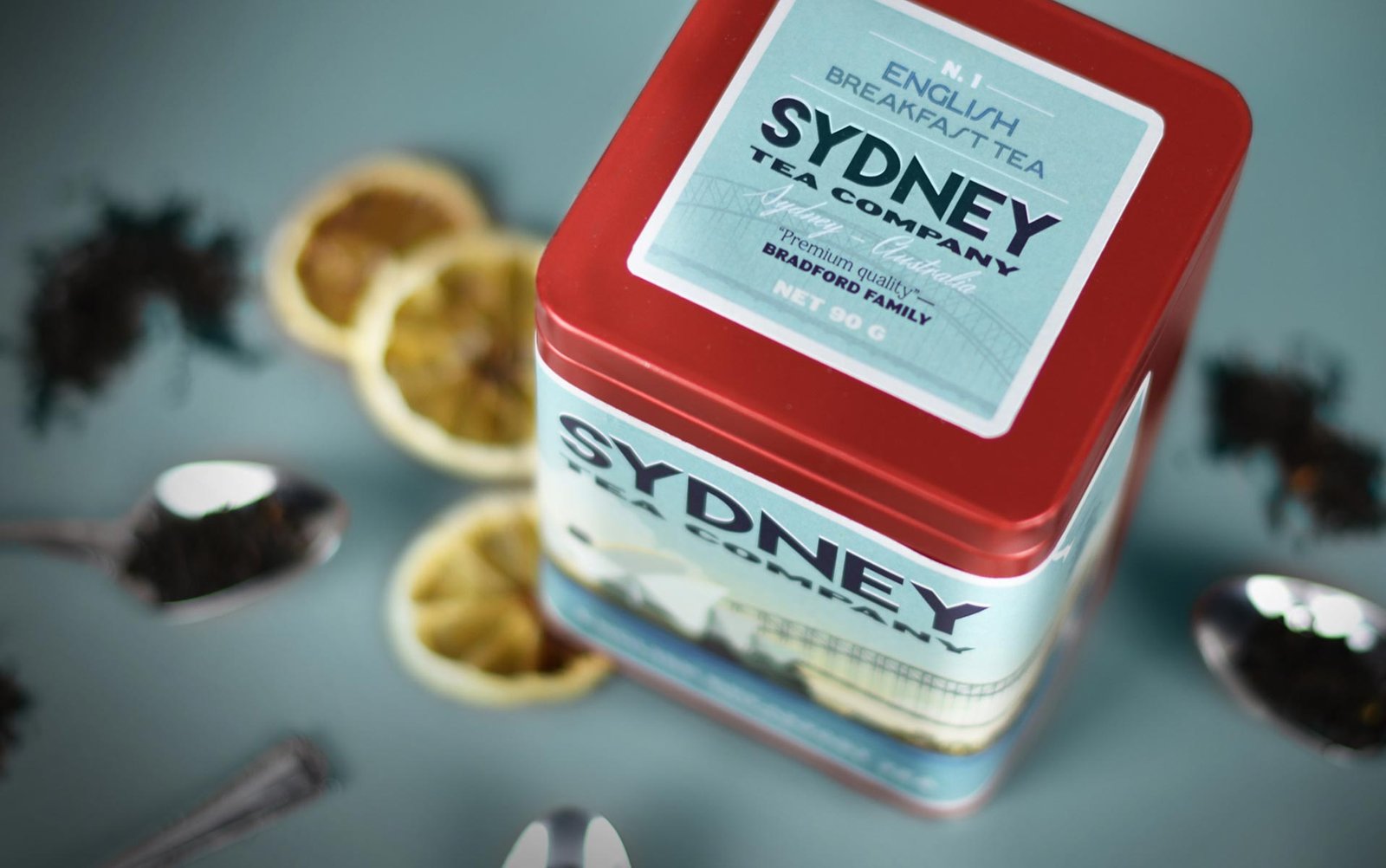
WE DESIGNED THE TEA PACKAGING FOR SIDNEY TEA COMPANY, AN AUSTRALIAN COMPANY THAT SELLS TEA IN LEAVES.
We opted for a retro aesthetic, obtained with the selection of typographies and the elaboration of industrial style illustrations. The protagonist of the label is an illustration of Sydney, with the most recognized view of this city, which surrounds the can beyond the front view. This way we get a panoramic effect close to photography.
We opted for a retro aesthetic, obtained with the selection of typographies and the elaboration of industrial style illustrations. The protagonist of the label is an illustration of Sydney, with the most recognized view of this city, which surrounds the can beyond the front view. This way we get a panoramic effect close to photography.
The color palette with greenish blues stands out against the red of the can and ties in with the retro aesthetic. The typefaces chosen are sans serif, thick and dark in color, so that they make an impact on the image.
We use cookies to ensure that we give you the best experience on our website. If you continue to use this site, we'll assume that you are happy with it.